Vertical and horizontal frames
The purpose of this project is to examine the pro’s and con’s of shooting horizontally and vertically. I have taken dozens of different examples, and have just put a few of them on the blog.
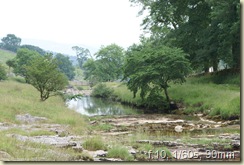
This first shot is one I would have naturally taken horizontally. I guess this is primarily because it seems to be best fitted to a landscape view.

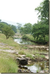
The same shot taken vertically actually produces quite a pleasing result. I think it gives a much better feel of depth. The large rock in the foreground helps this, and although I could have probably managed to get this in the landscape version, it would have meant being even further back.

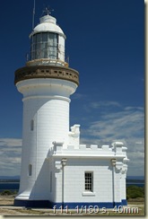
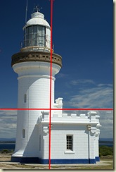
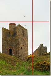
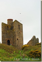
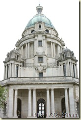
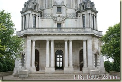
This next shot I would have taken vertically, as the interest in the subject is more in it’s height than it’s width.

As if to prove the point, the same subject taken horizontally look awkward, and it just seems that the top has been cut off (rather like the headless photographs my Mother used to take!)

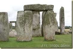
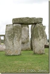
These standing stone at Stonehenge look equally good horizontally as they do vertically.


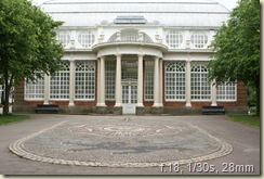
The view of this building looks good framed by the trees and showing the decorative stonework in front.

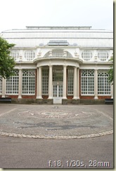
But when viewed vertically, it looks equally good and has again more feel of depth. The picture could have been better framed, with the trees equidistant, and the whole of the foreground stonework in the shot.

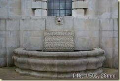
This one is quite interesting, because the horizontal shot is very much an horizontal subject, i.e. the water fountain and the trough.

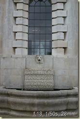
However, when taken vertically, it is equally interesting with the long window becoming much more of the subject.

What this does show is that in the final subject, I was far more interested in getting the trough in the shot, and was not really looking at the window as the subject.
I have to say though, that I was also trying to take the horizontal and vertical shots from exactly the same position and with the same focal length. In reality, I would have either moved back a little or changed the focal length to incorporate both the window and the trough.
Don’t be too critical, as this was an experiment to follow the project guidelines!
